SAAS Landing page Redesign
Visitors leaving so soon? "But you just got here…"
Quick-exiting visitors and low registration rates mean low ROI for clients who have purchased the SmartShopper healthcare cost transparency platform. That means customer churn for us. Not. Good. Time to address the landing page.
SKILLS/TOOLS
Content AUDIT / Strategy
STAKEHOLDER INTERVIEWS
COMPETITIVE AUDIT
WIREFRAMING
VISUAL DESIGN
PROTOTYPING
USER TESTING
A/B TESTING
METRICS ANALYSIS
THE STORY
Hmm… these numbers don't look so good:
Let's go talk to our call center folks.
30 minute interviews with 12 of our reps
Together with our call center reps, we identified these 8 common themes coming from our customers via calls and email:
What types of content do we need?
…and how will it all fit together?
Let's audit our current content to decide what stays or goes, and plot out what new content we might need based on our findings above. Then it's off to sketching, wireframing (tbh this is always one of my favorite parts of any project: so many possibilities!) and polished visual designs.
↑ Initial Sketch Wireframe ↓
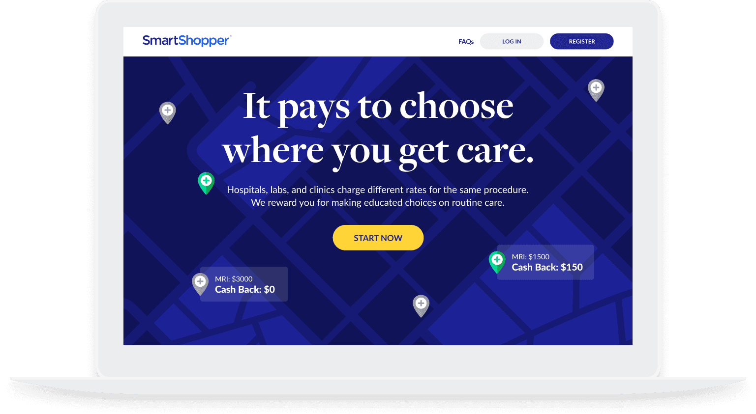
Final UI ↓
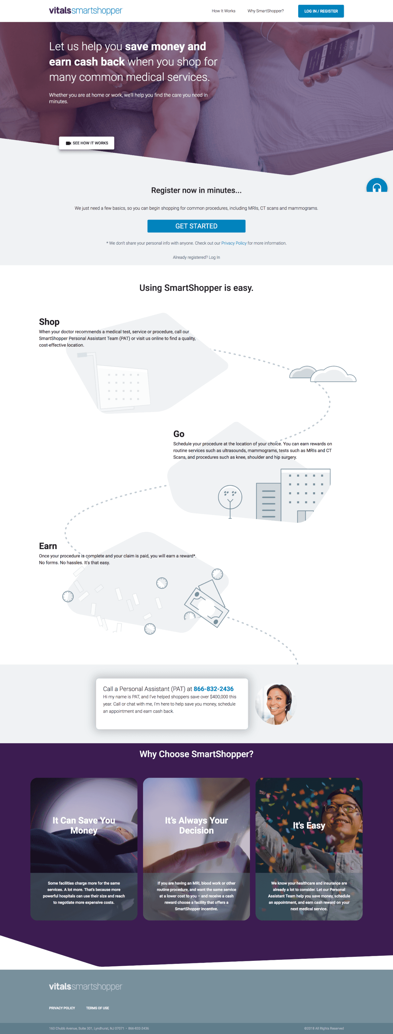
New / Old
Let's put this new design in front of some users.
This user was able to clearly validate our new design. They got "high marks" for their accuracy in not only understanding the program, but for being able to describe the nuances of it in their own words. Yes!
(the video is just under a minute… go ahead)
Wait what!? Our a/b tests show a 7% increase!?
We pitted old against new and…
According to our Google Analytics, we beat our original goal by 2%… SWEEET!
let's play

WORK


